
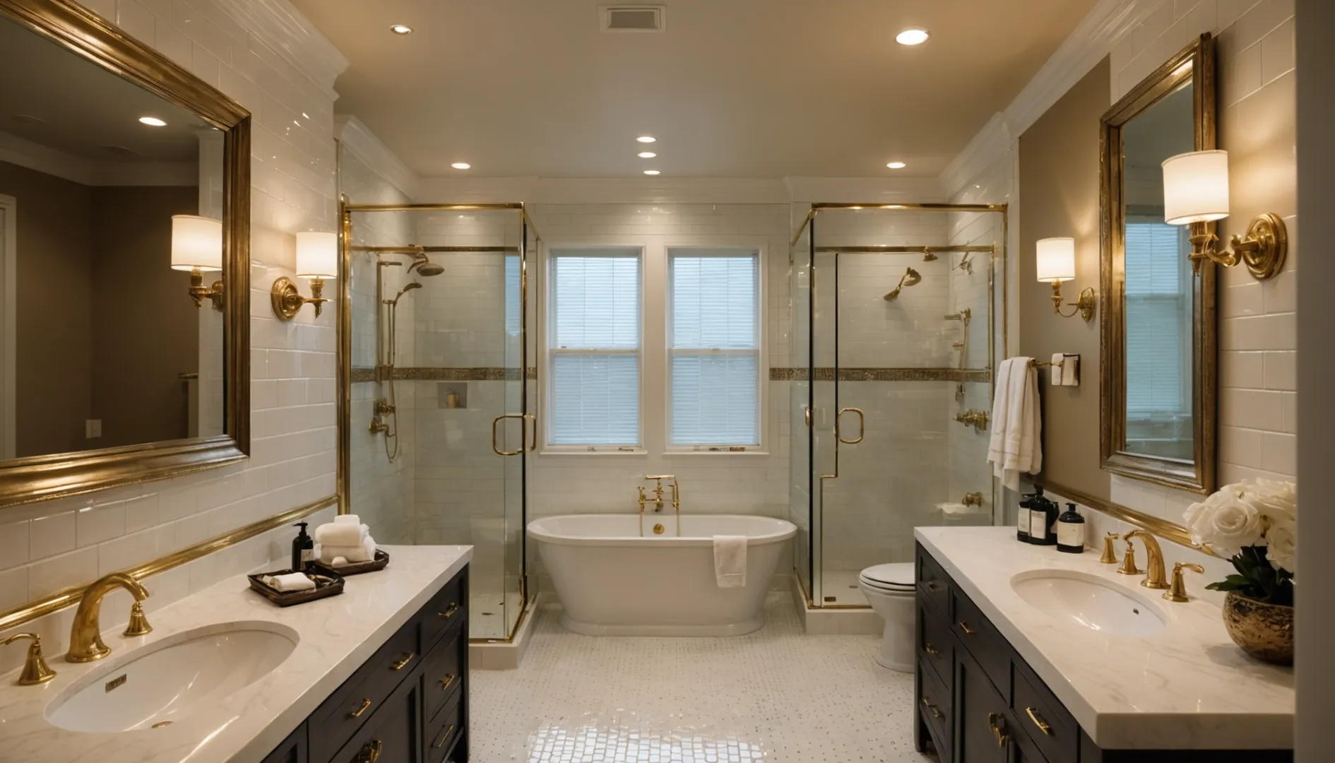
Choosing the right tile trim color can transform your interior space from ordinary to extraordinary.
Tile trim color is crucial in interior design as it influences the room’s overall aesthetic and functionality. The right color can harmonize with the tiles, highlight architectural features, and affect spatial perception. Careful selection ensures a cohesive and visually pleasing design.
While understanding why tile trim color matters is essential, knowing how to choose the right one can be challenging. The following sections delve into practical guidance, explore color theory principles, and examine different types of trims to assist you in making informed decisions.
Tile trim color can affect room size perception.True
Lighter trims make spaces feel larger, while darker trims create coziness.
How Does Tile Trim Color Influence Aesthetics?
Ever wondered how a simple change in tile trim color can transform your entire space?
Tile trim color significantly impacts aesthetics by enhancing tile design, creating visual contrast, and influencing mood. Selecting the right trim color complements and accentuates your tiles, seamlessly integrating them into your design vision.
Harmonizing With Tile Design
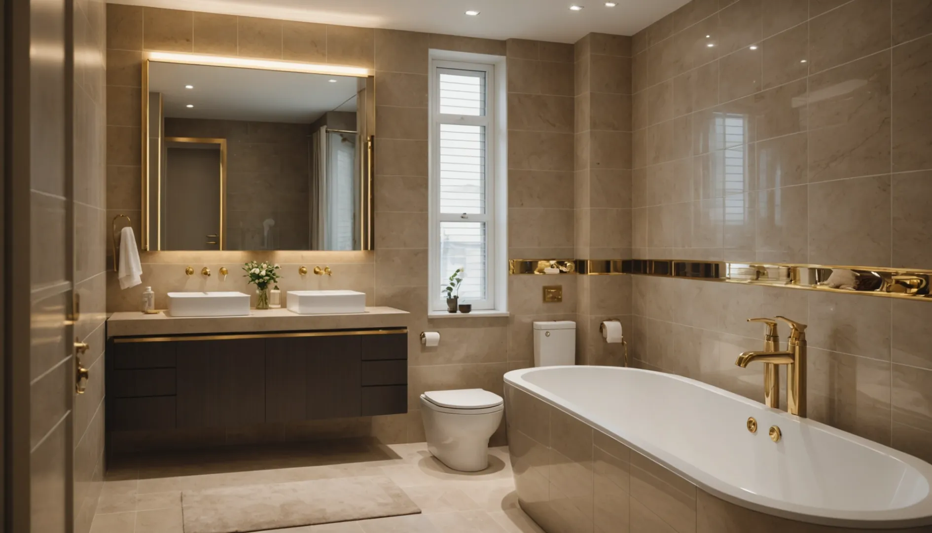
When selecting a tile trim color1, consider the tile design itself. A trim that matches or complements the primary tile can create a seamless, unified look. For instance, pairing white tiles with a silver trim can enhance a modern aesthetic, while a gold trim might complement warmer, earth-toned tiles. Consider using a color wheel to explore complementary colors that enhance your existing tiles.
Creating Visual Contrast
Contrasting colors can make a bold statement and add drama to any room. A dark trim against light tiles or vice versa can emphasize architectural features, like a niche or a backsplash. This contrast can act as a visual anchor, drawing attention to specific areas and creating a striking focal point in the room.
Influencing Mood and Perception
Color psychology plays a crucial role in interior design. Lighter trims can make spaces feel larger and more open, ideal for small bathrooms or kitchens. Conversely, darker trims can add warmth and coziness to expansive spaces. Understanding the psychological impact of colors can guide you in choosing a tile trim that supports the desired ambiance of your room.
Using Tile Trim as an Accent
Tile trim can also be used as an accent to inject personality into your space. For example, a vibrant blue trim in a neutral setting can create an unexpected pop of color, adding character without overwhelming the senses. This approach is especially effective in spaces where you want to introduce an element of surprise or interest.
| Tile Color | Trim Color | Effect |
|---|---|---|
| White | Silver | Modern & Sleek |
| Beige | Gold | Warm & Luxurious |
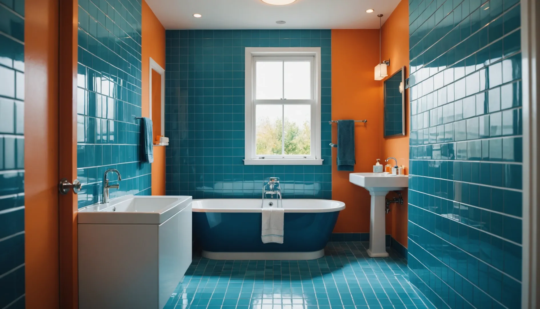
| Blue | Orange | Vibrant Contrast |
| Grey | Black | Bold & Defined |
Understanding how tile trim color influences aesthetics involves thoughtful consideration of your overall design goals and the specific effects you wish to achieve in each space.
Tile trim color can influence room size perception.True
Lighter trims make spaces feel larger, darker trims add coziness.
Contrasting tile trim colors always create a seamless look.False
Contrasting trims create bold statements, not seamless looks.
What Are the Functional Considerations for Tile Trim Color?
Selecting the right tile trim color involves more than just aesthetics; it serves crucial functional purposes.
The functional considerations for tile trim color include protecting edges, hiding imperfections, and enhancing lighting effects. Choosing the right color can prevent damage, maintain cleanliness, and improve safety, making it a vital aspect of practical interior design decisions.
Protecting Tile Edges and Surfaces
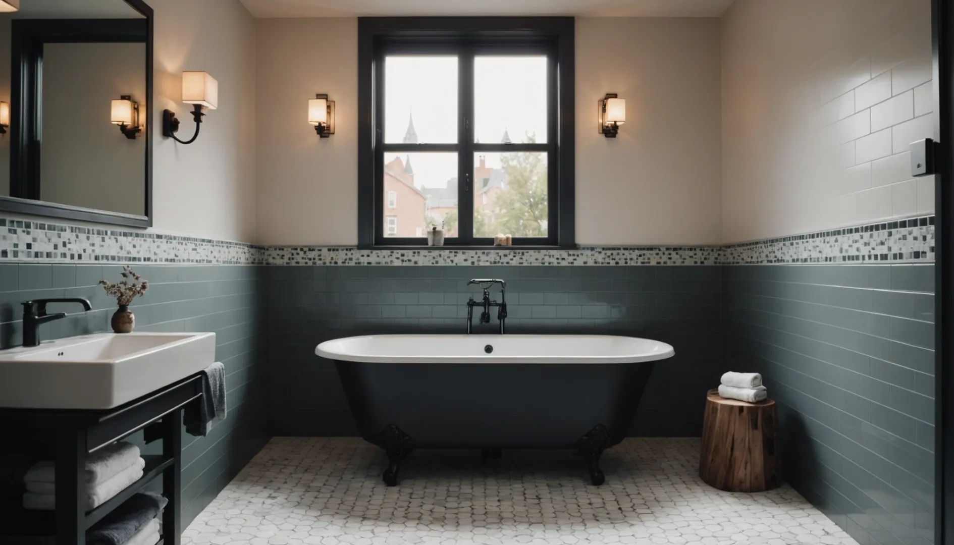
Tile trim plays a vital role in safeguarding tile edges from chipping and wear, especially in high-traffic areas. A well-chosen color not only complements the tiles but also contributes to their durability. For example, using a darker trim color in kitchen floors can mask potential wear and tear over time, ensuring longevity.
Concealing Imperfections
A seamless transition between tiles and surrounding areas can be achieved with the right trim color. If there are minor installation imperfections or if the tiles aren’t perfectly aligned, a matching or complementary trim color can help conceal these discrepancies. This creates a polished and professional finish that enhances the overall look of the space.
Enhancing Lighting and Visibility
Consider how different trim colors interact with natural and artificial lighting. Light-colored trims can reflect light, making a small space appear larger and more open. On the other hand, darker trims can absorb light, providing a cozy and intimate atmosphere. In areas like bathrooms, where visibility is crucial, choosing a trim color that enhances lighting can significantly improve safety.
Maintaining Cleanliness
Tile trims are often easier to clean than grout lines or the tiles themselves. Selecting a trim color that doesn’t show dirt easily can be practical in spaces prone to spills or moisture, such as kitchens and bathrooms. For instance, a mid-tone gray trim may hide water stains better than a white one.
Harmonizing with Room Functionality
In areas where functionality is paramount, such as commercial kitchens or industrial settings, choosing a trim color that aligns with the functional requirements of the space is crucial. For example, using trims that contrast with the tile can highlight boundaries and enhance spatial orientation, reducing accident risks.
Discover more about choosing tile trim colors2 by considering practical factors along with aesthetics. These considerations ensure that your space is not only beautiful but also functional and enduring.
Darker trim colors enhance tile durability.True
Darker trims can mask wear and tear, enhancing durability in high-traffic areas.
Light-colored trims reduce room visibility.False
Light trims reflect light, increasing visibility and making spaces appear larger.
How Can Color Theory Guide Your Tile Trim Choices?
Unlock the power of color theory to make impactful tile trim choices for your space.
Color theory can guide tile trim selection by helping create harmony, contrast, and balance. Understanding color relationships and the emotional impact of hues ensures your tile trims complement the overall design and purpose of the room.
Understanding Color Harmony
Color harmony is crucial when selecting tile trim colors3. It refers to the visually pleasing arrangement of colors that creates a balanced and harmonious look. There are several ways to achieve color harmony:
- Monochromatic schemes involve using various shades of a single color, creating a clean and cohesive appearance.
- Analogous schemes use colors next to each other on the color wheel, offering a serene and comfortable design.
- Complementary schemes involve colors opposite each other, like blue and orange, delivering a vibrant and dynamic contrast.
By understanding these schemes, you can choose tile trims that either blend seamlessly or stand out dramatically against your tiles.
The Emotional Impact of Colors
Colors evoke emotions and set moods. For instance, warm colors4 like reds, oranges, and yellows are energizing and can make spaces feel inviting and lively. Cool colors such as blues, greens, and purples tend to be calming and can make a room feel more spacious.
When choosing your tile trim color, consider the atmosphere you want to create. A spa-like bathroom may benefit from cool, relaxing tones, while a vibrant kitchen might embrace warm, lively trims.
Enhancing Architectural Features
Tile trims can also be used to highlight architectural features. For instance, using contrasting trim can draw attention to unique design elements such as arches or alcoves. If your aim is to emphasize these features, consider bold color choices5 that create striking visual interest.
Practical Application: Color Swatches
A practical approach involves creating swatches to visualize how different colors will look in your space. Here’s a simple table to help you plan:
| Base Tile Color | Trim Color Option 1 | Trim Color Option 2 | Trim Color Option 3 |
|---|---|---|---|
| White | Light Gray | Black | Soft Blue |
| Beige | Chocolate Brown | Olive Green | Terracotta |
| Gray | Navy Blue | Mustard Yellow | Cherry Red |
Experimenting with swatches allows you to assess how various trims interact with your tiles under different lighting conditions and with surrounding decor.
Monochromatic schemes create a cohesive look.True
Using shades of one color provides a clean, unified appearance.
Warm colors make spaces feel smaller and cooler.False
Warm colors energize and can make spaces feel inviting, not cooler.
What Types of Tile Trims Are Available for Different Designs?
Selecting the right tile trim can enhance your design, ensuring both beauty and durability.
Tile trims come in various types, including square edge, rounded edge, L-shaped, and more, each suited to different design needs. These trims not only protect tile edges but also contribute to the overall aesthetic, offering finishes in metals, plastics, or ceramics.

Exploring Different Tile Trim Profiles
Understanding the different tile trim profiles6 available is essential in achieving your desired design outcome. Here are some common types:
-
Square Edge Trim: Often used for a clean, minimalist finish, square edge trims are ideal for contemporary designs where sharp lines and angles are desired.
-
Round Edge Trim: This type provides a soft, curved finish, perfect for traditional or classic interiors where softer lines are preferred.
-
L-Shaped Trim: Known for its versatility, L-shaped trims can be used in various applications, offering protection and a clean finish to the tile edges.
Material Considerations for Tile Trims
The material of your tile trim can significantly influence both the functionality and aesthetics of your design. Here’s a breakdown:
| Material | Characteristics | Best For |
|---|---|---|
| Metal | Durable, sleek | Modern designs |
| Plastic | Cost-effective | Utility spaces |
| Ceramic | Classic look | Bathrooms, kitchens |
Each material has its unique properties that can enhance your design or offer practical benefits.
Choosing the Right Tile Trim for Your Design
When selecting a tile trim, consider both the design style and the environment in which it will be used. For instance, metal trims7 might suit a modern kitchen due to their sleekness and durability. Meanwhile, ceramic trims can complement classic bathroom designs with their timeless appeal.
Think about the color of the trim in relation to your tiles. A contrasting color can highlight the edges and create a striking visual effect, while a matching trim offers a seamless look.
Practical Tips for Tile Trim Selection
- Assess Your Design Style: Choose a trim that complements your overall interior style.
- Consider the Environment: Use durable materials like metal in high-moisture areas.
- Balance Functionality and Aesthetics: Ensure the trim protects while enhancing visual appeal.
By understanding these different types and considerations, you can make an informed decision that supports both the aesthetic and functional needs of your space.
Square edge trims suit contemporary designs.True
Square edge trims provide a clean, minimalist finish ideal for modern styles.
Plastic trims are best for classic bathroom designs.False
Plastic trims are cost-effective and suited for utility spaces, not classic designs.
Conclusion
Selecting the right tile trim color is pivotal for cohesive and impactful design. Consider color theory and practical elements to enhance your space.
-
Discover guidelines for matching tile trim with specific tile designs.: Our guide to choosing tile trim and molding completes your backsplash or shower with the right pencil liner or bullnose tile for the location and type of … ↩
-
Explore how functional benefits complement aesthetic choices for tile trim.: Its main function is to provide a neat, attractive appearance to the exposed edges of tiles while also protecting them from physical damage. ↩
-
Discover methods to harmonize tile trim with existing decor.: By selecting one colour and adding the two colours sitting on either side of its complement, a split complementary colour scheme is created. The … ↩
-
Learn how warm colors affect mood and perception in spaces.: Bright, warm colors (reds, oranges, yellows) stimulate energy and happiness while cool, subdued colors (blues, greens, purples) are soothing and calming. Bright … ↩
-
Explore the effects of bold colors on architectural features.: Color blocking is just one way to integrate bold colors into your home. It’s about using large blocks or panels of bold, bright colors to create contrast and … ↩
-
Learn about various tile trim profiles to enhance your design choices.: Round Edge Tile Trims. These trims have a rounded edge profile and are commonly used for finishing the exposed edges of wall tiles. They create … ↩
-
Discover why metal trims are favored in modern design settings.: Stainless steel tile trim is very strong and won’t rust, corrode, or change color easily. The chromizing process makes iron stronger against rust by creating a … ↩